Widgets
October 2024
WidgetKit concept for car status widgets, fuel, EV charge, engine state, tire pressure, and cabin temperature, each built as a single glanceable card instead of a full companion-app screen.
Case study
Checking a car's status from a phone usually means opening the companion app, waiting for it to load, then tapping through to the one screen that has the number you actually want.
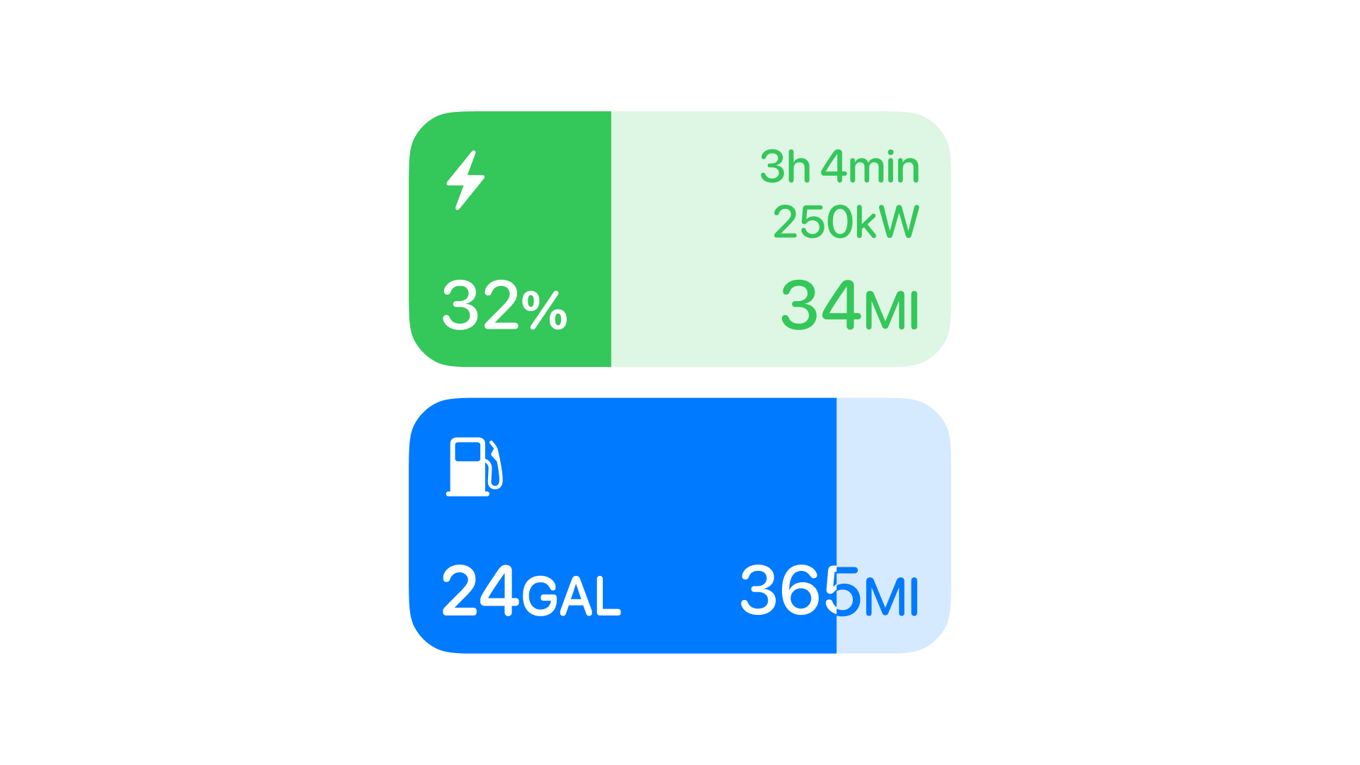
This concept skips all three steps: a fuel level, a charge estimate, a tire pressure warning, each one lives as its own widget on the Home Screen or Lock Screen, readable without unlocking into the app at all.
Project overview
A self-directed concept, not a client brief, built around WidgetKit, Apple's framework for small, glanceable views that live on the Home Screen, Lock Screen, or StandBy display without opening the full app, rather than a custom in-app dashboard. Every widget here was designed against that constraint: a fixed size, no scrolling, and a refresh cycle the system controls rather than the app pushing updates in real time.
- Fuel, battery, engine, tire pressure, and cabin temperature as the tight set of data points in scope;
- No custom iconography, SF Symbols only, so a car widget reads as native rather than a manufacturer's app bolted onto iOS.
Both limits pushed the same direction: less to design, more time spent on whether a single number was legible at a glance.
The problem
Most companion car apps feel heavy the moment someone wants a single number instead of a dashboard.
Checking tire pressure, range, or engine status meant opening the companion app, waiting on a loading state, then navigating to the right screen, all for one number that should have been visible at a glance.
Both failures came from treating a glance and a full session as the same interaction.
Competitor benchmarking
I looked at CarPlay patterns and companion apps like Tesla and MyHyundai, and most solutions felt overbranded, cramming a full dashboard into a widget-sized space instead of designing for it.
Conversations with friends who drive EVs and hybrids surfaced a pattern the competitor apps missed entirely: the same driver needs different information depending on when they check.
Range is the only number that matters. Everything else, tire pressure, engine status, can wait until the car is actually moving.
That shaped the set of widgets pursued: no single dashboard trying to serve all three moments, a small set of single-answer cards instead.
Sizing
Card sizes and densities got tested against the rhythm of Weather and Calendar widgets already sitting on a driver's Home Screen, since a car widget next to them had to hold the same visual weight without reading as bolted-on.
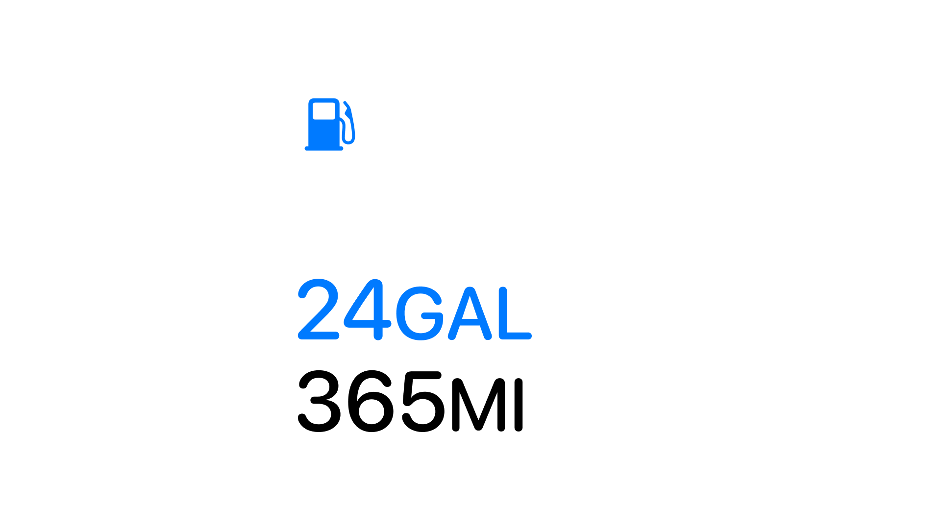
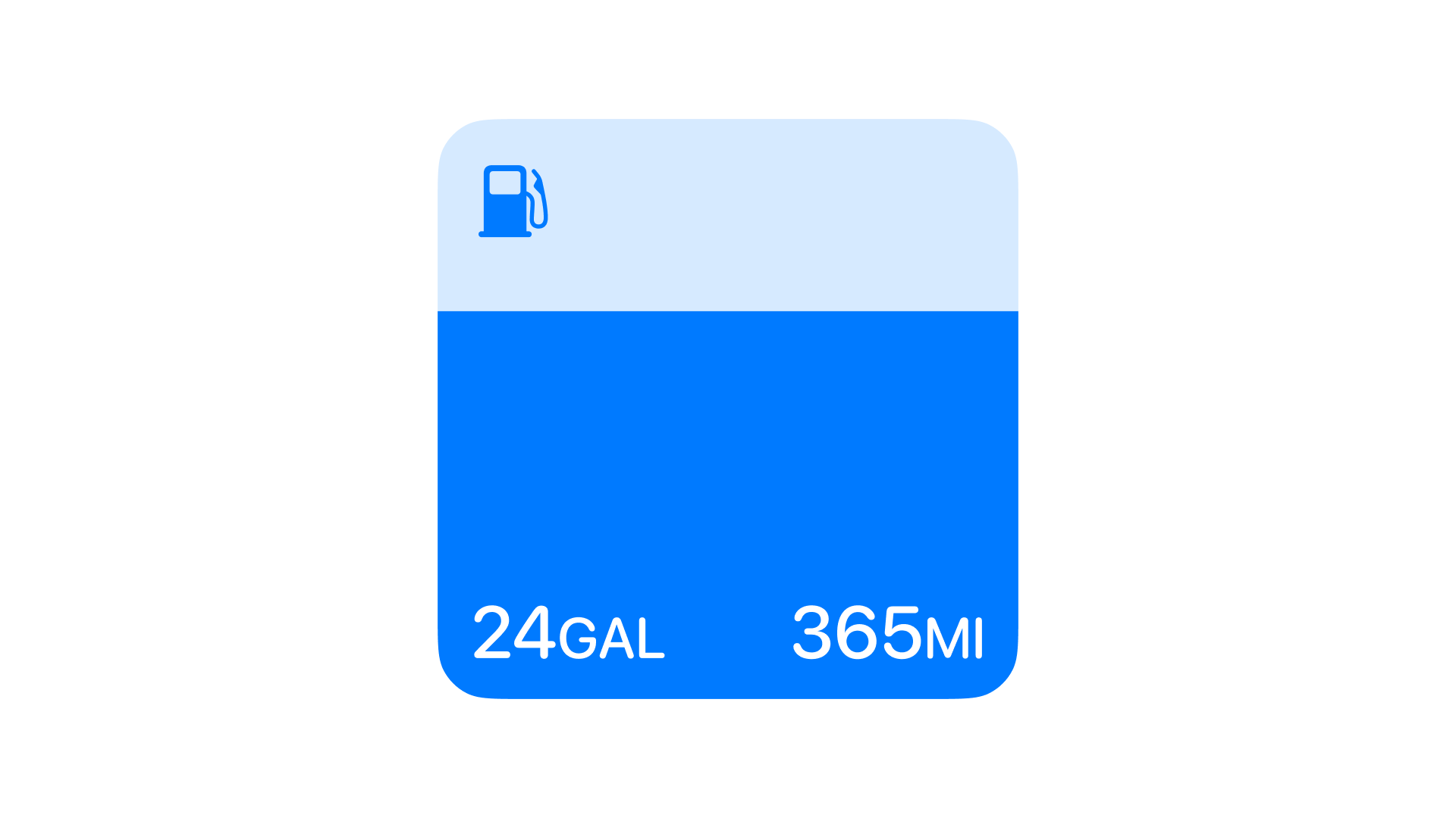
The same two numbers, a fuel level and a range estimate, had to hold up at a small square and at a wider card. That ruled out any layout depending on extra space showing up later: the compact version is not a cropped version of the expanded one, it is a separate composition built for its own size.
EV charging
The charging widget pairs two states most companion apps split across separate screens.
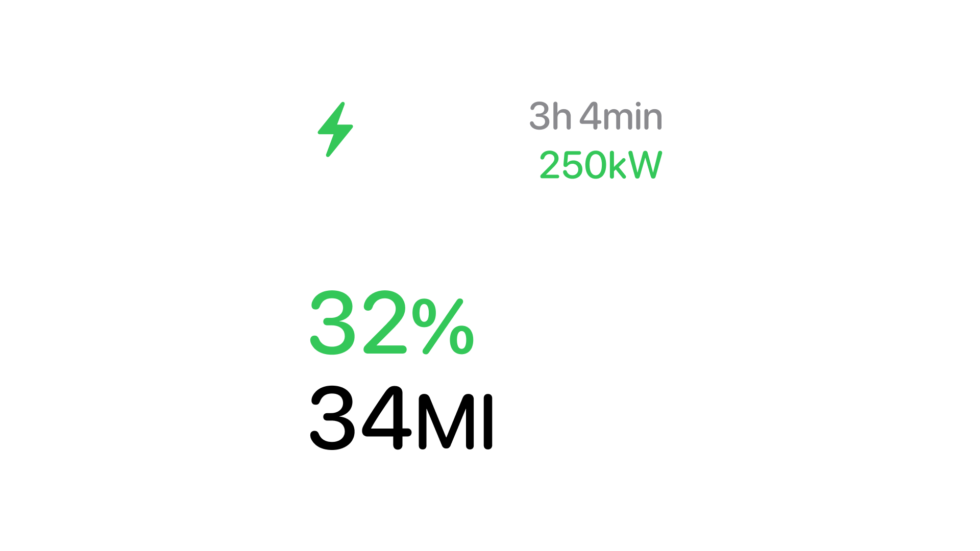
The charging card pairs percentage and range on one row, time-to-full and charging rate on the other. Color does part of the work before a driver reads a single number, green marks the card as electric on sight.
Engine status
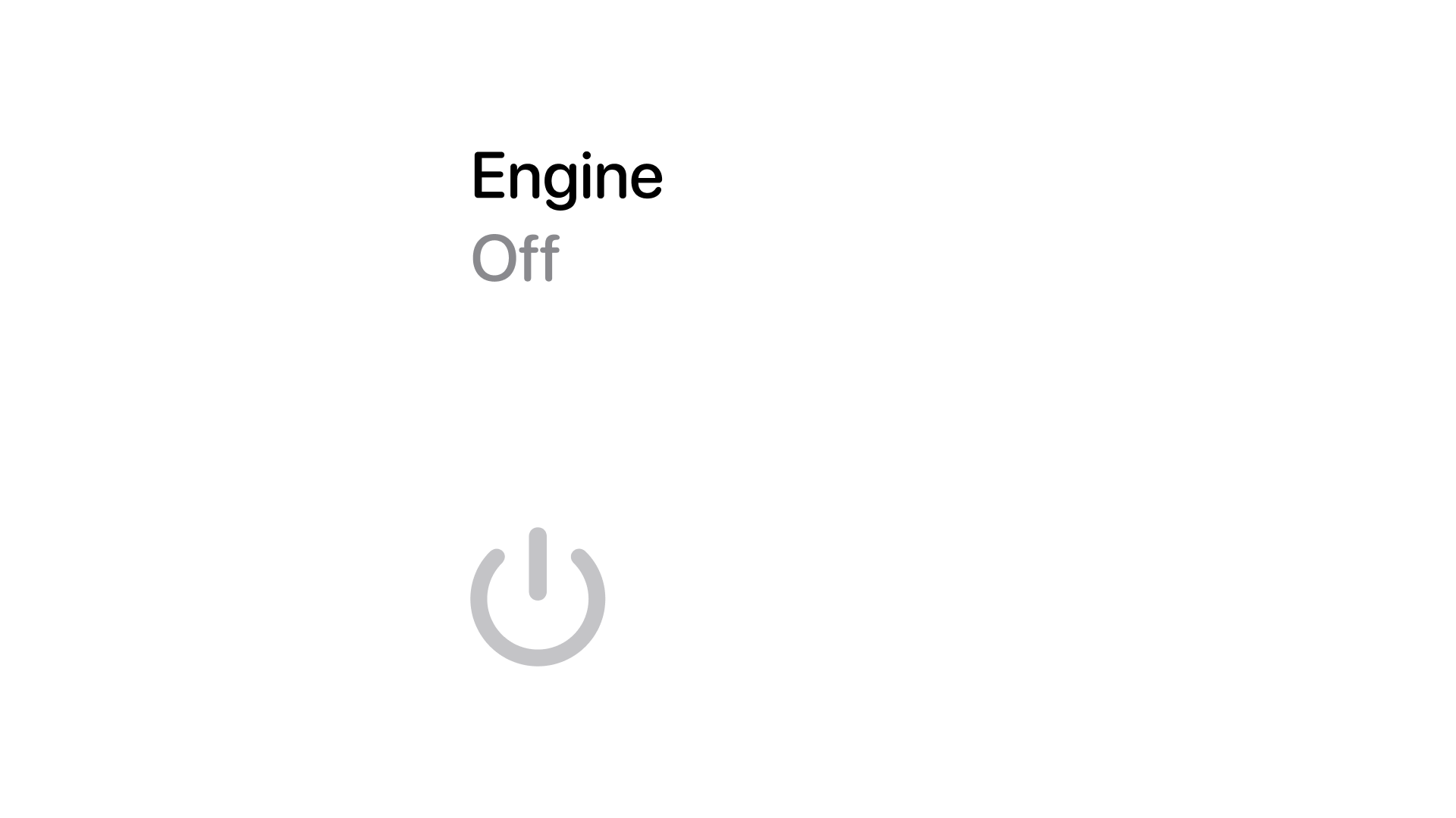
Off needed to read as neutral, not broken. The resting state uses the same grey as an inactive iOS toggle rather than a warning color, since a parked car with the engine off is the expected state, not an error worth flagging.
Tire pressure
Tire pressure is the one reading where a single wheel matters more than the average.
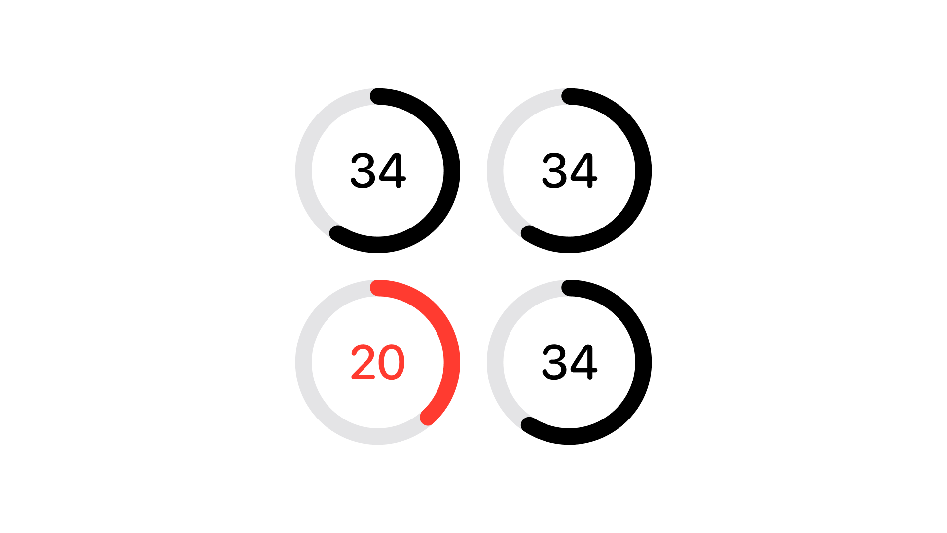
Four rings track pressure per wheel, filled black at a healthy reading and red the moment one drops out of range. In the version shown here, three wheels read 34 psi and one reads 20 psi and that single red ring is the entire point of the widget, catching the one number that changed without reading all four every time.
Cabin preconditioning
Climate is the one card where a countdown matters as much as the number itself.
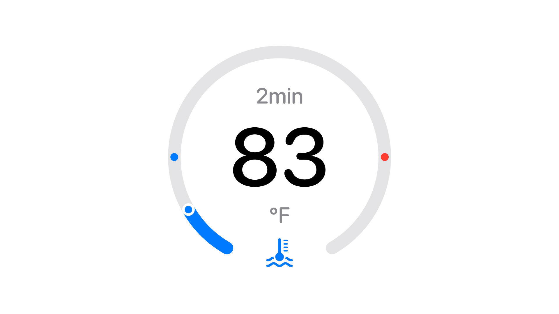
A circular gauge shows target cabin temperature, 83°F in the version shown here, and the 2 min left until the car reaches it, set before a driver opens the door. Blue and red mark the low and high ends of the dial, so the current setting reads as a position on a range rather than an isolated number with no context.
Efficiency
Efficiency is the one card that trades a single number for a short history.
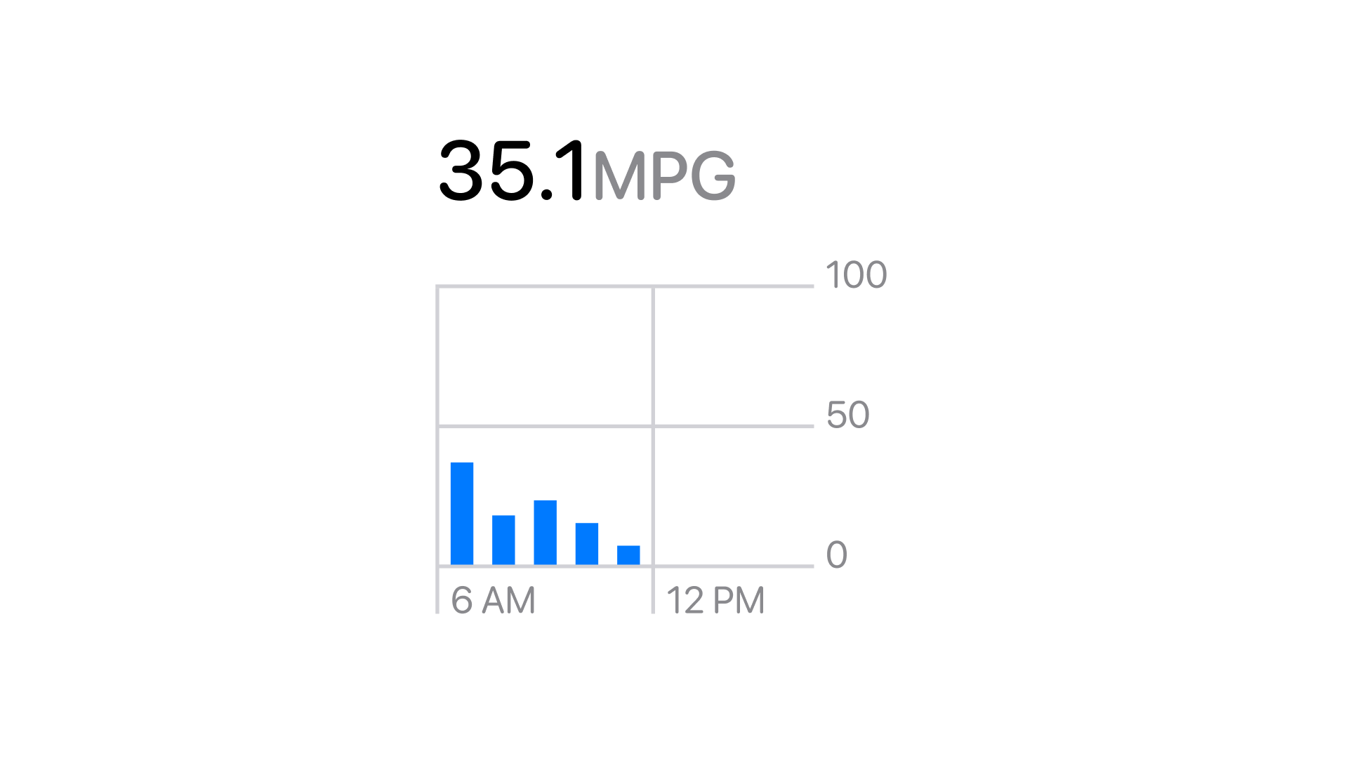
A bar chart tracks fuel economy through the day against a fixed 0-to-100 scale, so a short trip does not visually dwarf a longer one sitting next to it. The average at the top, 35.1 mpg in the version shown here, is the number that actually matters, while the bars underneath stay context rather than the headline.
Visual and motion
The visual language stays modular and quiet: rounded rectangles, high-contrast type, and SF Symbols instead of custom iconography, so a widget reads as native rather than borrowed from a car manufacturer's own app.
A value that changes breathes instead of flashing, a slight scale animation on the charge indicator, nothing sharp enough to catch a driver's eye while the car is moving. Presence without pull was the standard every motion decision got checked against.
What I learned
Designing small does not mean thinking small. It means editing harder, being precise about space, contrast, and tempo when there is no second screen available to hide an unclear decision on.
The best parts turned out to be invisible. A widget that works does not get noticed, a driver reads the number and moves on, which made restraint the actual skill being practiced here, not any single visual choice.
Questions
Apple's framework for Home Screen, Lock Screen, and StandBy widgets. Building against it instead of a custom in-app dashboard meant every card had to work within Apple's own size and refresh constraints, which is what forced the single-answer approach in the first place.