Noque
March 2024
Mobile marketplace for ordering pickup and delivery from independent restaurants, with loyalty points tracked per restaurant instead of one shared program.
Case study
Noque is a mobile marketplace for ordering from independent restaurants: browse what's nearby, customize an order, and pick it up or have it delivered, all from one app instead of a different one per restaurant.
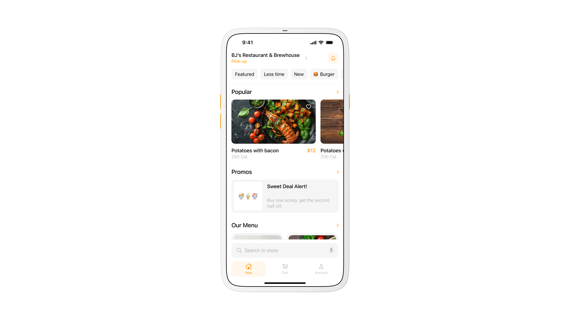
The restaurant page keeps the menu in front, with a single switch between pickup and delivery instead of two separate flows. A bottom tab bar with search built into it keeps the actions used most, ordering, cart, account, reachable without digging through a nested menu.
Project overview
A single mobile marketplace where people browse nearby restaurants, order fast, and collect rewards without switching apps. The brief also had to work for the restaurants themselves: a small cafe without the budget for its own app still needed a real presence in the marketplace.
- Pickup treated as the default flow, not an afterthought bolted onto delivery;
- Loyalty tracked per restaurant instead of one generic points system across the whole marketplace.
Both choices came directly from the problem, since a generic delivery clone would have solved less than half of what small restaurants and quick-pickup customers actually needed.
The problem
Ordering food is slower than it should be for a quick pickup, and loyalty made it worse instead of better.
A line at a cafe or a food court forces a wait before an order even starts, then another wait for it to be made. Nothing about standing in line adds value to the order itself.
Solving one without the other would have left half the frustration in place.
Competitor benchmarking
I watched how people ordered in food courts and coffee shops before designing anything. Decision fatigue and slow queues were the constant, not one bad menu or one slow cashier.
Benchmarking the large delivery marketplaces surfaced three gaps that mattered more for quick pickup than for delivery:
- Pickup treated as a secondary flow behind delivery, not the primary one;
- Customization buried a few taps deep instead of visible on the item card;
- Loyalty run as one program across every restaurant, diluting what any single venue could offer.
Those three gaps set the direction for the concept that followed.
Key concept
Two ways to receive an order, pickup and delivery, with pickup treated as the primary path instead of a delivery flow with pickup bolted on. Pickup cuts the fees a delivery order carries, removes the wait on a courier, and gives a restaurant a reason to bring someone through the door with an in-person offer.
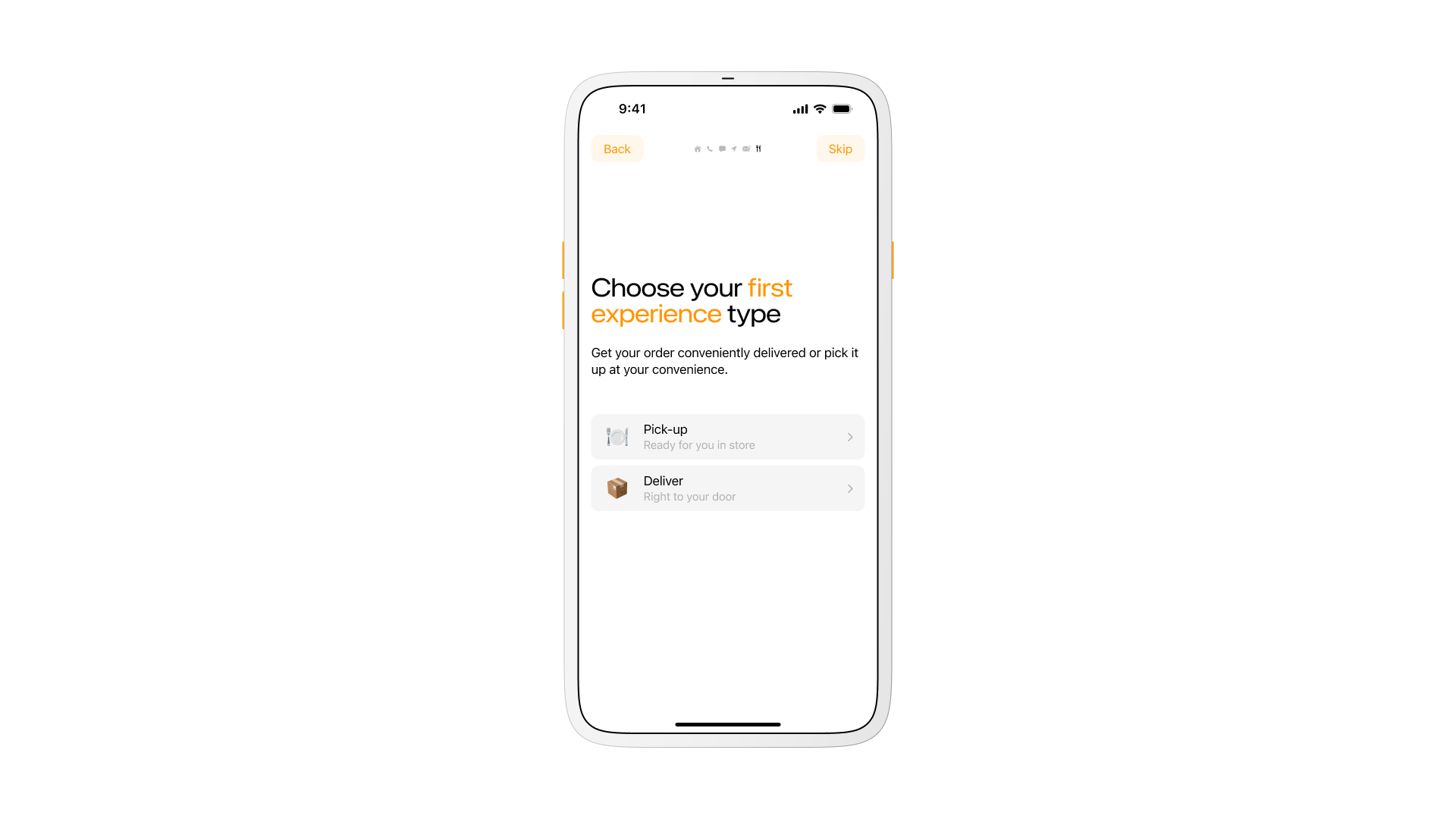
That choice is the first thing a new user sees, before a single restaurant loads.
Store discovery
Finding a restaurant starts with a map, not a search field.
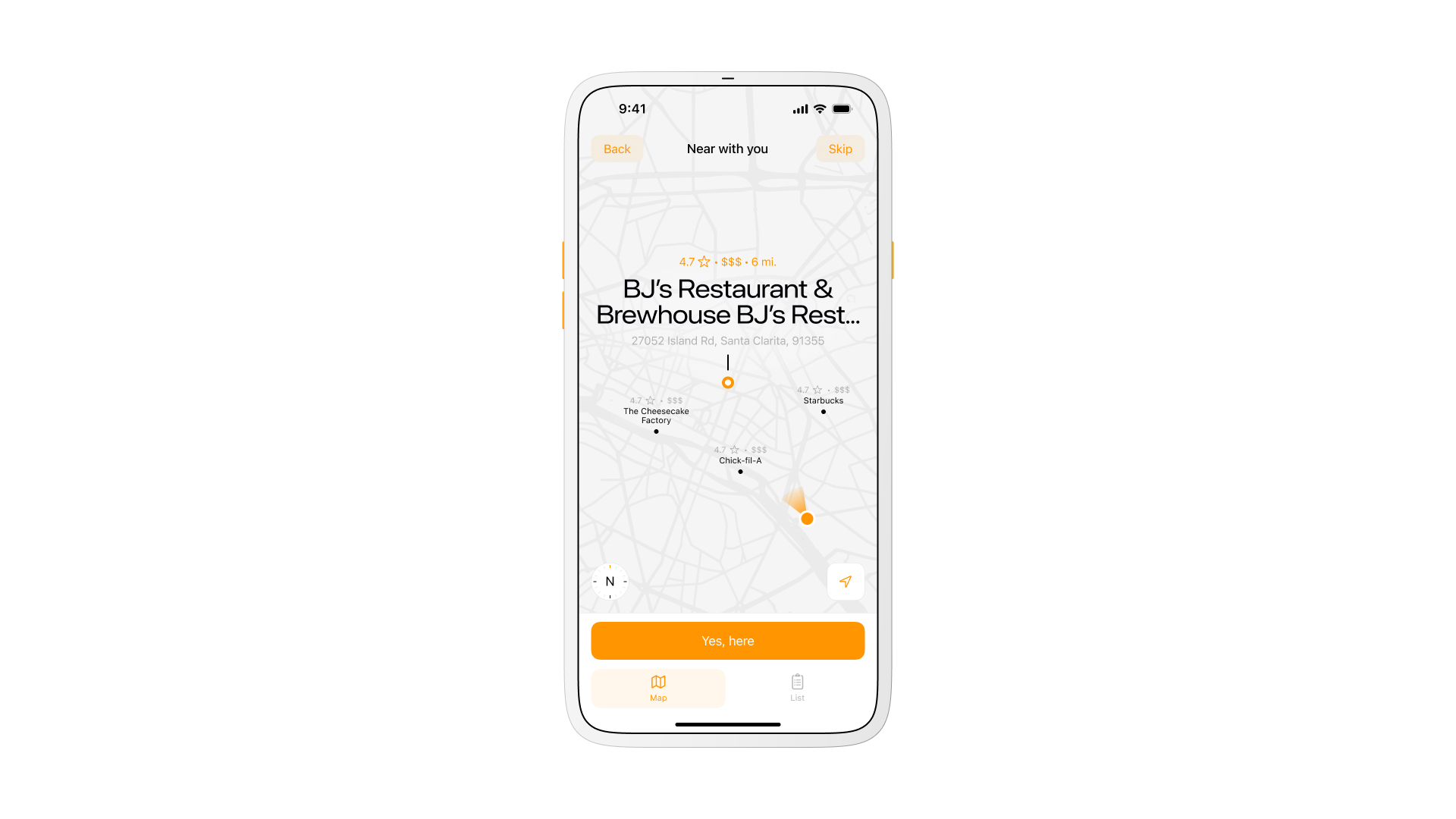
The map surfaces the closest options first, with a list view underneath for anyone who would rather scan names and ratings than pins on a map. Confirming a store, Yes, here, is a single tap once the right one is on screen, instead of a separate page loading to confirm it.
Product view
Every item card holds actions and results in the same view instead of splitting them across two screens.
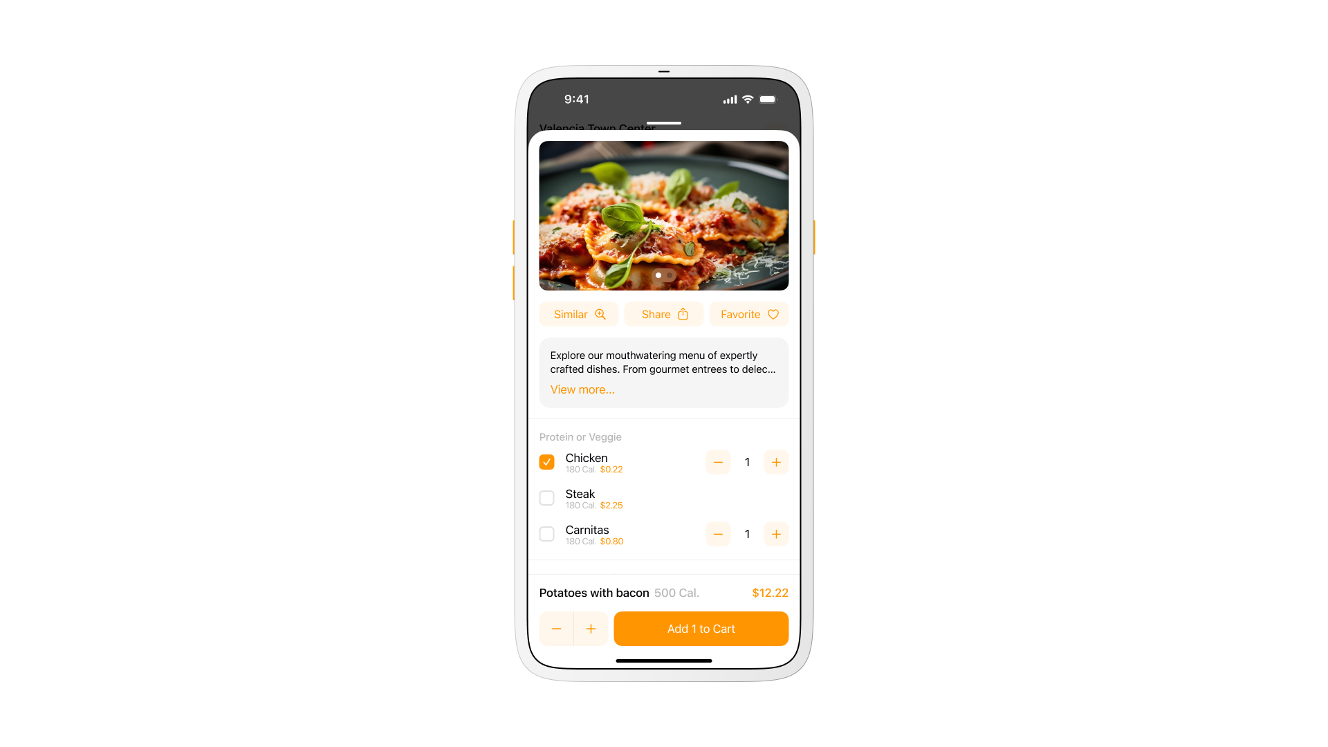
Picking chicken, steak, or carnitas updates the calorie count and price in place, with the total visible before the tap that adds it to the cart. A shortcut to similar dishes sits next to the description, for anyone comparing options without leaving the flow.
Cart
A mixed order needed its own math, not one combined total.
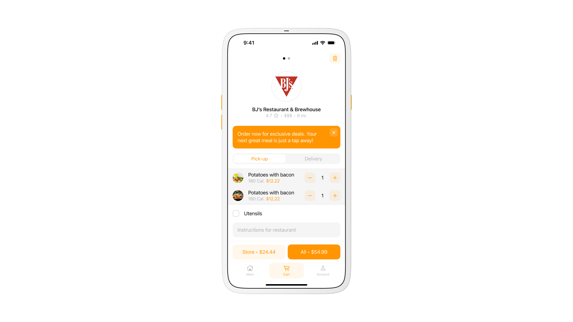
An order spanning more than one restaurant checks out as separate totals per store instead of one blended charge. In the cart shown here, the current restaurant totals $24.44 on its own, and $54.99 once every restaurant in the cart is included, so a mixed order never hides which restaurant charged what.
Items stay grouped by restaurant, with cutlery, item removal, or clearing a whole group handled in one step instead of hunting through a flat list.
Rewards
Every restaurant runs its own balance instead of pulling from one shared marketplace pool.
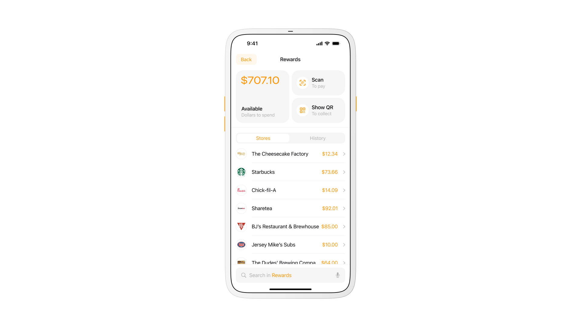
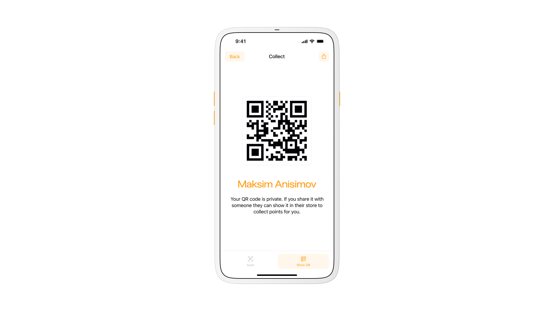
Points build up against the restaurant that earned them instead of pooling into one marketplace-wide balance. The account shown here holds $707.10 total, split unevenly across seven restaurants, from $10.00 at Jersey Mike's Subs up to $92.01 at Sharetea. A restaurant owner sets their own offers against that balance, so a customer feels the value tied to the specific place they keep returning to, not a generic marketplace-wide discount.
Scan to pay and Show QR to collect cover the same interaction from both directions: a customer's code gets scanned in store, or a restaurant's code gets scanned from the customer's side, depending on who is holding the phone that reads it.
Account and favorites
Everything outside ordering itself collapses into one tab.
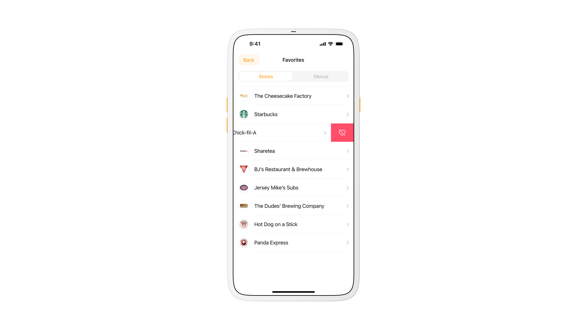
Favorites and account settings sit one tab away from ordering, not buried behind a separate settings app. Removing a favorite takes a single swipe, the same gesture used elsewhere in the app instead of a dedicated confirmation step.
Target audience
Students, singles, couples, and office workers who order to save time or skip cooking made up the core audience, generally between 18 and 45 with average or above-average income. Speed, value, and convenience mattered more to this group than restaurant discovery for its own sake, which is part of why pickup outranked delivery as the primary flow.
Role
I originated the idea, led the concept, and worked as product designer and art director on it. Coordinating with developers, an analyst, and sales shaped the scope as much as any single design decision did.
Sketches moved to prototypes, then through rounds of testing and feedback, until the flow read as instant rather than merely functional.
Design system
A token-based design system carried color, type, and spacing across more than 34 screens, with a dark theme designed in parallel instead of retrofitted afterward. Building both themes from the same pass kept them from drifting apart as the screen count grew.
Workflow
Discovery and market research fed into iterative prototyping, combining patterns familiar from large marketplaces with the specific needs pickup introduces: faster confirmation, clearer per-restaurant totals, loyalty that does not require its own separate app. The result optimized for quick decisions and minimal friction over feature breadth.
What I learned
Noque started as a workaround for a personal annoyance, standing in line for something that should have taken one tap. It became a practice in restraint instead, since every screen had to earn its place against how fast someone could get from open app to picked-up order.
The project changed how I think about time as a design constraint, not just loading time or pickup time, but the time a decision takes when the options in front of someone are actually the right ones.
Questions
Pickup is the primary flow, not delivery with pickup added on. Loyalty is tracked per restaurant instead of one marketplace-wide points system, and a small restaurant without the budget for its own app still gets a real presence instead of a listing buried behind bigger chains.