Musyka
November 2024
Music app concept built around a persistent mini player and comments pinned to an exact timestamp in a track, so a reaction and the moment that caused it stay in the same view.
Case study
Musyka is a concept for a music app built around one idea: listening and reacting shouldn't require two different screens. A persistent mini player stays visible everywhere in the app, and a comment attached to a track points at the exact second that prompted it, not just the song as a whole.
The starting point was a specific frustration with existing music apps, where pressing play felt instant but everything after that, finding something new, seeing what a friend thought about a specific moment, felt like leaving the music to go do something else.
Project overview
A solo concept, not a client brief, scoped to iOS phone screens only.
- Four screens, Now Playing, Explore, Library, Friends, kept deliberately tight instead of expanding into a full app surface;
- One mini player, docked to every tab, rather than a separate now-playing state per screen.
Both limits kept the comparison to Spotify and Apple Music honest, since fewer screens meant every one of them had to justify the player taking up permanent space at the bottom.
The problem
Most music apps get heavy the moment someone wants to do more than press play, and two failures showed up across the apps studied.
Finding something new took a search, a scroll, or a curated playlist picked days earlier. None of it matched the one-tap feeling of just pressing play.
Both failures pulled attention away from the song itself, which is the one thing a music app should protect.
Competitor benchmarking
I reviewed how Spotify, Apple Music, and YouTube Music handle discovery and social features, then looked outside music entirely at TikTok and BeReal for how they handle quick reactions.
- Spotify, Apple Music, YouTube Music: strong catalogs, a thin social layer, discovery buried behind search or a curated tab;
- TikTok, BeReal: quick feedback loops, content tied to a specific moment rather than a whole session.
The common thread across the social apps was timestamped context, since a reaction pinned to a second carried more information than a like on the song overall, and that became the starting point for comments in Musyka.
The solution
Keeping someone inside the song while surfacing what a friend thinks at the exact second holds attention better than pulling them into a separate feed. That principle ruled out a few directions early, a dedicated feed screen for comments, a separate messaging tab, anything that pulled a listener away from the track already playing.
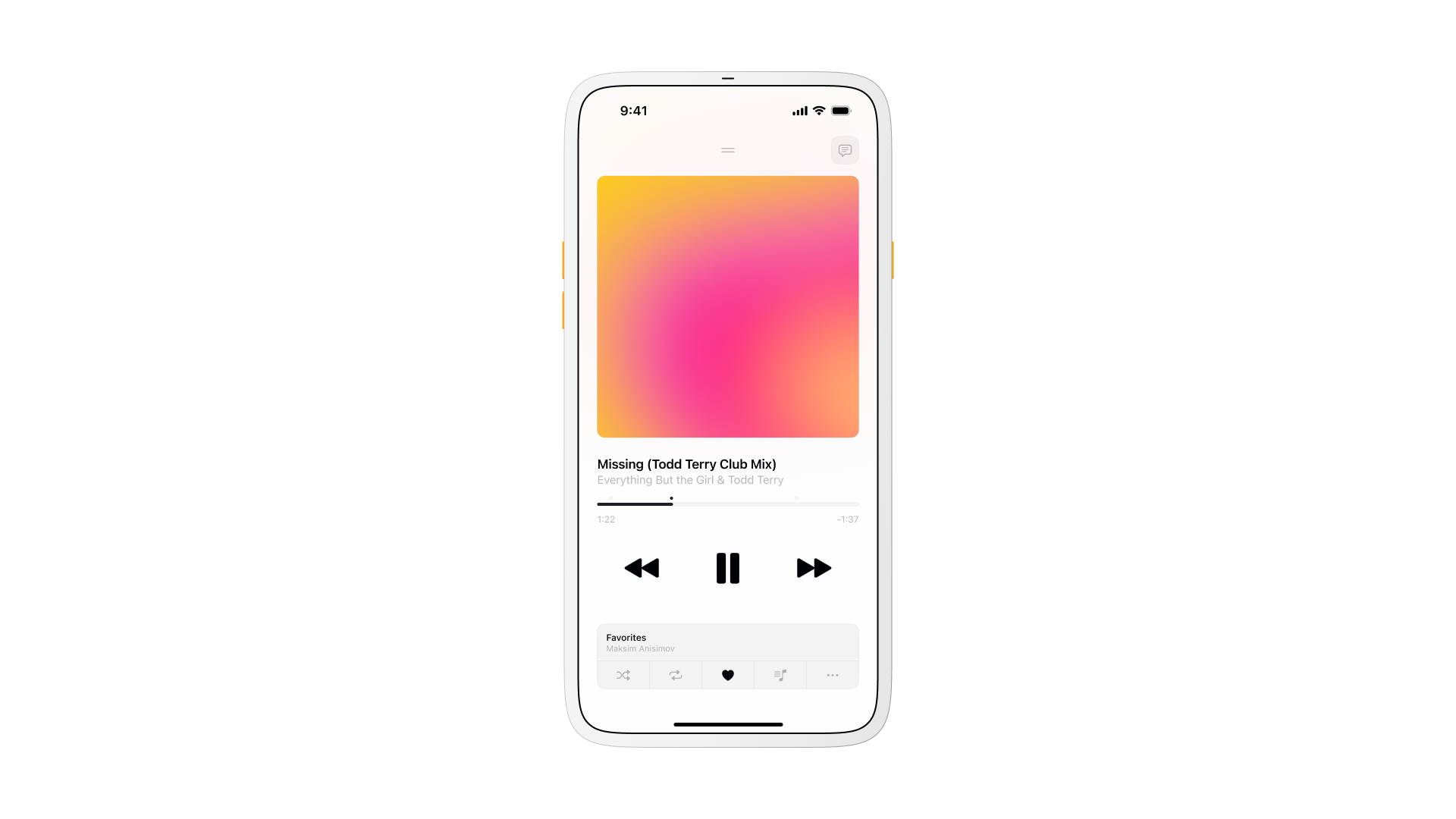
The response centered on two mechanics: a mini player docks to the bottom of every tab, so the current track stays reachable from Explore, Library, or Friends without a second tap to get back to it, and comments attach to a timestamp instead of a track, so a reaction points at the exact second that caused it.
A comment ties to a specific second in a track rather than the song as a whole, shown as a marker on the scrubber that jumps playback to that second when tapped.
Explore
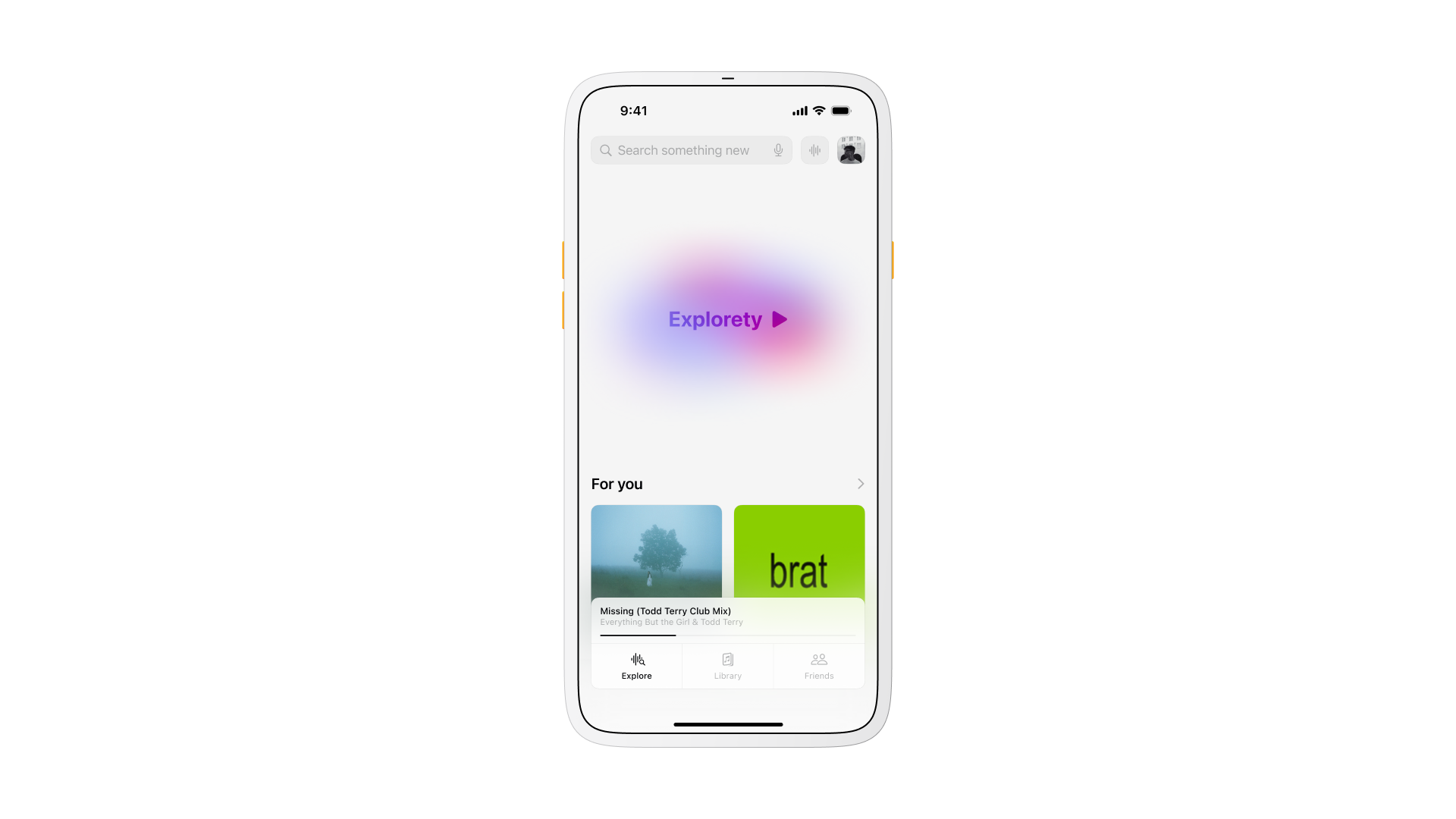
Explorety is the single entry point on the home tab: one large control that starts an endless stream of tracks with a tap, instead of a search bar asking what to type first. A For You rail sits underneath it for anyone who wants to browse instead of just pressing play.
The tab reduces to two states on purpose, play something now, or scroll a short list, so a returning listener never has to relearn where to start.
Now Playing
The player sits at the center of the app: art, a scrubber, and like, save, skip, and comment controls reachable with one hand.
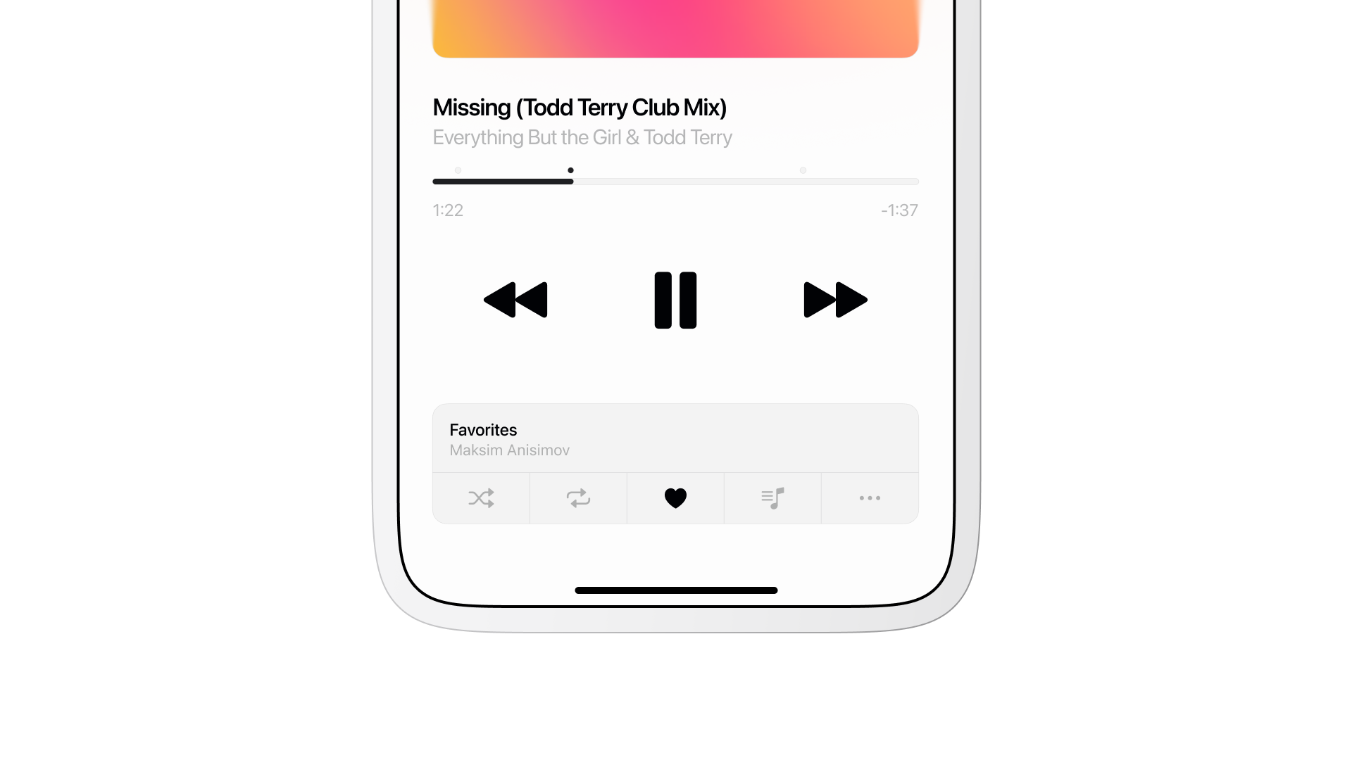
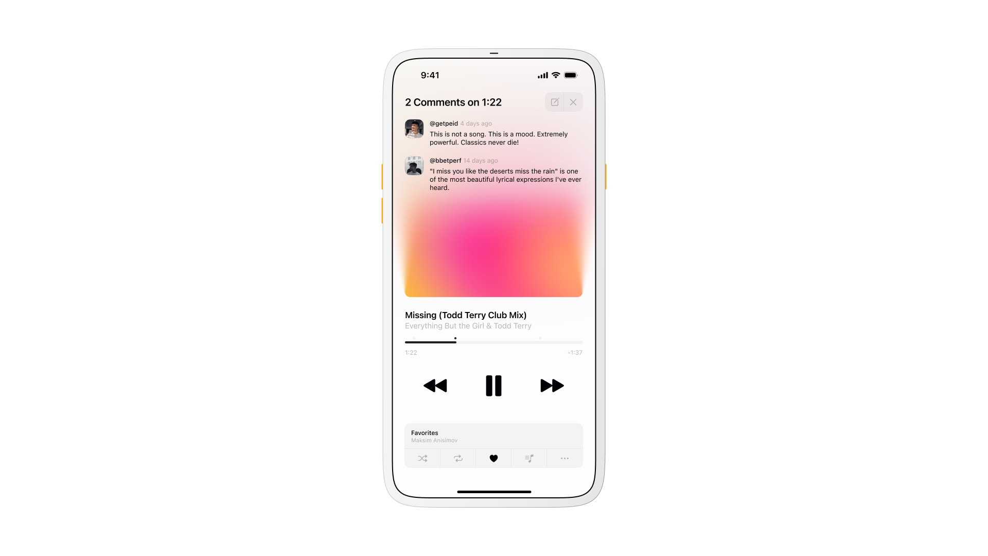
Tapping a comment jumps playback to the exact second it was left on, 1:22 in the track shown here, so reading a reaction and hearing what caused it happen in the same motion instead of two separate steps.
Library
Library stays to two sections, Albums and Songs, instead of the folders and smart playlists most streaming apps default to. The goal was a screen that reads at a glance, built for finding something specific rather than browsing.
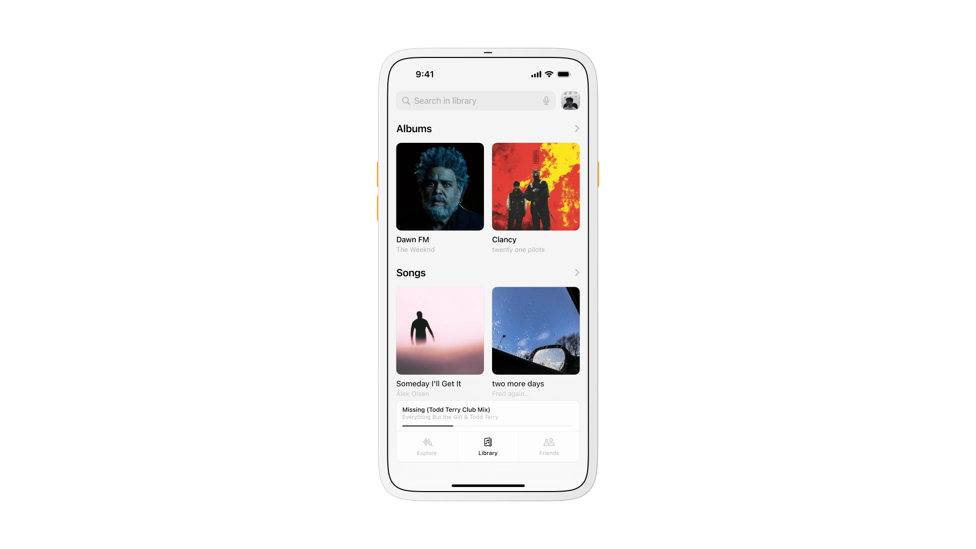
Both sections stay flat, with no folders or nested playlists to dig through before a saved track shows up.
Friends
Every social feature lives on one tab instead of spreading across the app: SharePlay, chats, update notifications, and shared playlists, next to a friends list split into all friends, favorites, and blocked.
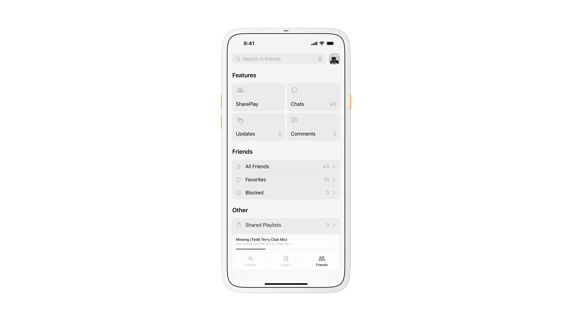
Reacting to a track or building a shared playlist happens without leaving the people who are actually going to hear it.
Flow
The core loop stays short on purpose: open the app, hit Explorety, hear something, react or save, keep moving, and nothing in the flow asks for a decision before the music starts.
A map of the four screens acted as a checklist while designing each one. Any new feature had to earn a place on an existing screen before a fifth tab got considered, which kept scope from creeping past what a mini player and four tabs could reasonably hold.
Success metrics
None of the numbers below were measured outside the prototype, but they set the target the flow was designed around: starts triggered from Explorety, taps into a timestamped comment, saves to Favorites, and shared playlists created. Together they describe whether the experience reads as fast, social, and worth returning to, not just a working player.
Visual language
The surface stays quiet on purpose so the album art carries the color: soft gradients behind the player, calm scaling on transitions, nothing competing with the artwork for attention.
A short pulse animation marks the moment play starts and the moment a comment reveals, enough to catch the eye without pulling focus off the track.
Interaction heuristics
A short set of heuristics got checked against every screen before it counted as done.
- Status visible at all times, current track, current tab, current friend count;
- Controls in the same place on every screen;
- One way to perform each core action, no duplicate paths to the same result;
- An undo or a back option within one tap of any action.
Consistency mattered more than any individual heuristic, since a listener who learns the pattern on Now Playing should never have to relearn it on Friends.
What I learned
The interface worked best when it stopped feeling like an interface. Putting comments next to playback made the app feel alive without turning it into a chat client, which was the actual risk of the whole idea: get the balance wrong, and Friends becomes a messaging app that happens to play music.
A second pass would simplify the Friends hub and tighten the comment composer so writing a reaction feels as quick as tapping play. Composing still asks for more attention right now than the one-tap feeling the rest of the app promises.
Questions
A small marker sits on the scrubber at the second someone left it, and tapping it opens the comment and jumps playback to that second, so reading the reaction and hearing what caused it happen together instead of requiring a search through the track.