Kodomi
December 2024
No-code platform for building real websites from GitHub-connected UI libraries, a token-based design system, and an AI assistant that generates pages from a prompt.
Case study
Kodomi is a no-code platform for designers and small teams who need to build a real website, not a mockup of one. A page built in Kodomi publishes as a working site, styled from the same design tokens as every other page in the project, whether its components came from a connected GitHub library, the built-in marketplace, or a prompt typed into the AI Designer.
The idea came out of a recurring problem: sharing an interface idea with a client or a developer took longer than designing it did. A mockup communicated the look of a page, but it did not communicate a working page, and the gap between the two ate most of the schedule on every project.
Project overview
A no-code platform where designers and developers can connect UI libraries from GitHub, build real sites, and publish them through a system that holds together across every page in a project. The brief was self-imposed, aimed at individuals and small teams rather than specialists working inside an existing design system.
- No dedicated engineering team beyond one developer and one art director;
- A working design system needed before any investor conversation.
Both constraints shaped scope more than any single feature request did. The token system had to be solid enough to demo cold, and every screen had to hold up without a larger team behind it to patch inconsistencies.
The problem
Design tools handed off a picture of an interface, while no-code builders assembled a live one. Every project sat in the gap between those two, and two structural failures kept showing up there.
A finished mockup still had to be rebuilt by a developer, who translated spacing, states, and interactions by eye. That translation step is where consistency broke down, and where most of the schedule disappeared on every project.
Neither gap was a tooling limitation so much as a structural one, since nothing in the existing workflow treated a component as a persistent, shared object.
Competitor benchmarking
I mapped the space across five existing no-code builders, Webflow, Framer, Bubble, Wix, and a smaller tool called TapTop, and each handled part of the problem but none handled all of it.
- Portable component libraries that survive a move between projects;
- Version history on individual components, not just whole-project snapshots;
- A sitemap clear enough to plan a full site before building a single page.
Those three gaps recurred across every platform audited, and they became the baseline Kodomi had to clear before anything else got designed.
The solution
Modularity became the answer to both gaps at once. A component that already carries its own tokens travels cleanly between projects, and a site built from those components publishes as the working page a developer would otherwise have had to rebuild.
The response had three parts: UI libraries connect straight from GitHub, so an existing component set does not need to be rebuilt inside Kodomi from nothing; a marketplace sits next to that connection, for a kit bought whole or a single element bought on its own; and underneath both, a token-based design system keeps color, type, spacing, and motion consistent no matter which library a page pulls from.
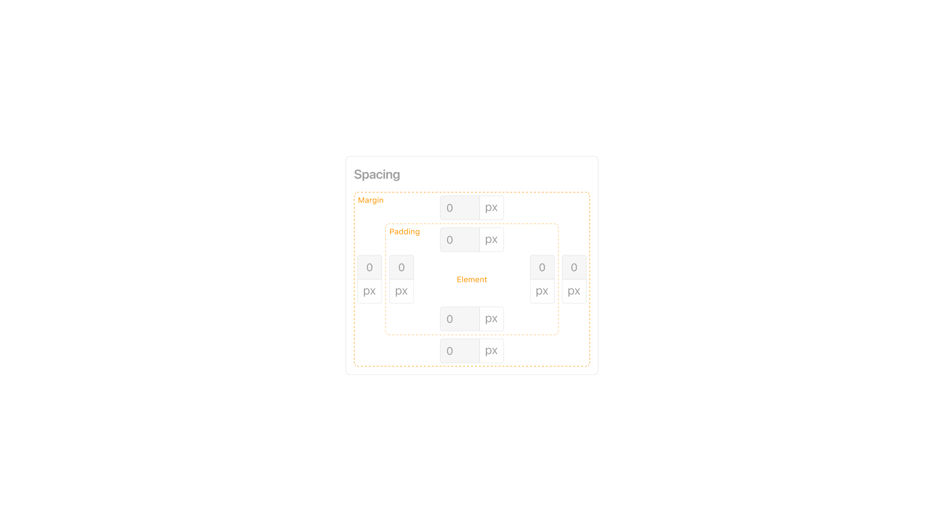
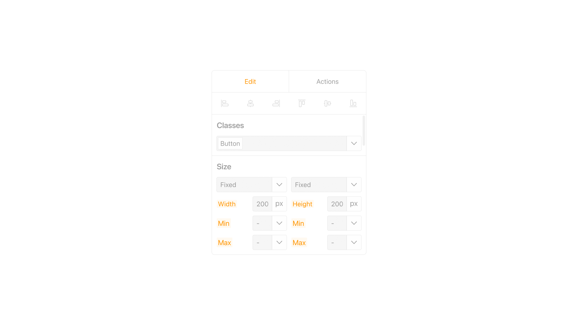
Every button, input, and header in Kodomi pulled its width, color, and spacing from the same token set, which is what let a page built from three different libraries still read as one product.
Persona development
No formal interviews shaped these personas. They came out of the benchmarking phase, matched against the three groups most likely to actually adopt a tool like this.
Needs a site she can update herself after launch, without calling a developer for a copy change or a new photo.
All three validated the same three decisions: a library model that travels between projects, a sitemap that shows the whole site before it gets built, and an AI assistant that removes the blank-canvas start.
Sitemap
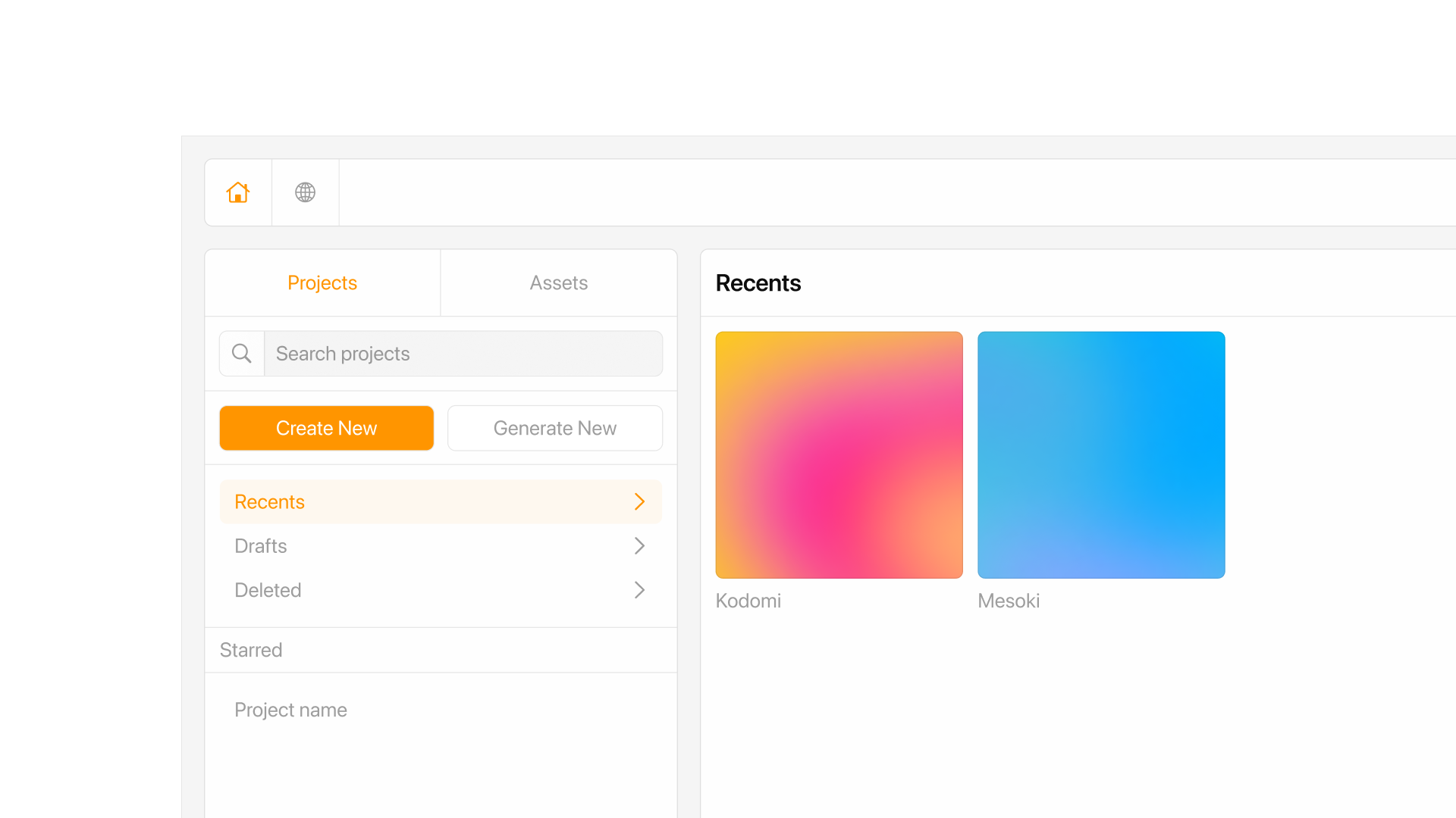
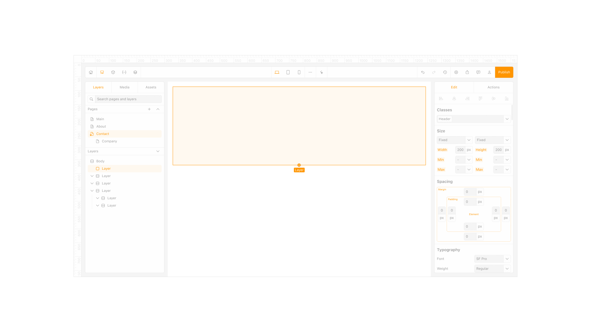
Every project opens onto a page list instead of a single canvas: Main, About, Contact, Company, each one holding its own layer tree. A page can reference a header or a layout built on another page in the same project rather than rebuilding it from scratch.
That is where the library model actually pays off: a header built once shows up correctly on every page that references it, and a change to that header updates every page that uses it at the same time.
Design system
Color, type, spacing, and motion all inherit from tokens, so a change to a base value cascades through every component built on top of it instead of requiring a manual pass through every screen.
Light and dark themes got built early, before the screen count grew past what a manual pass could realistically catch.
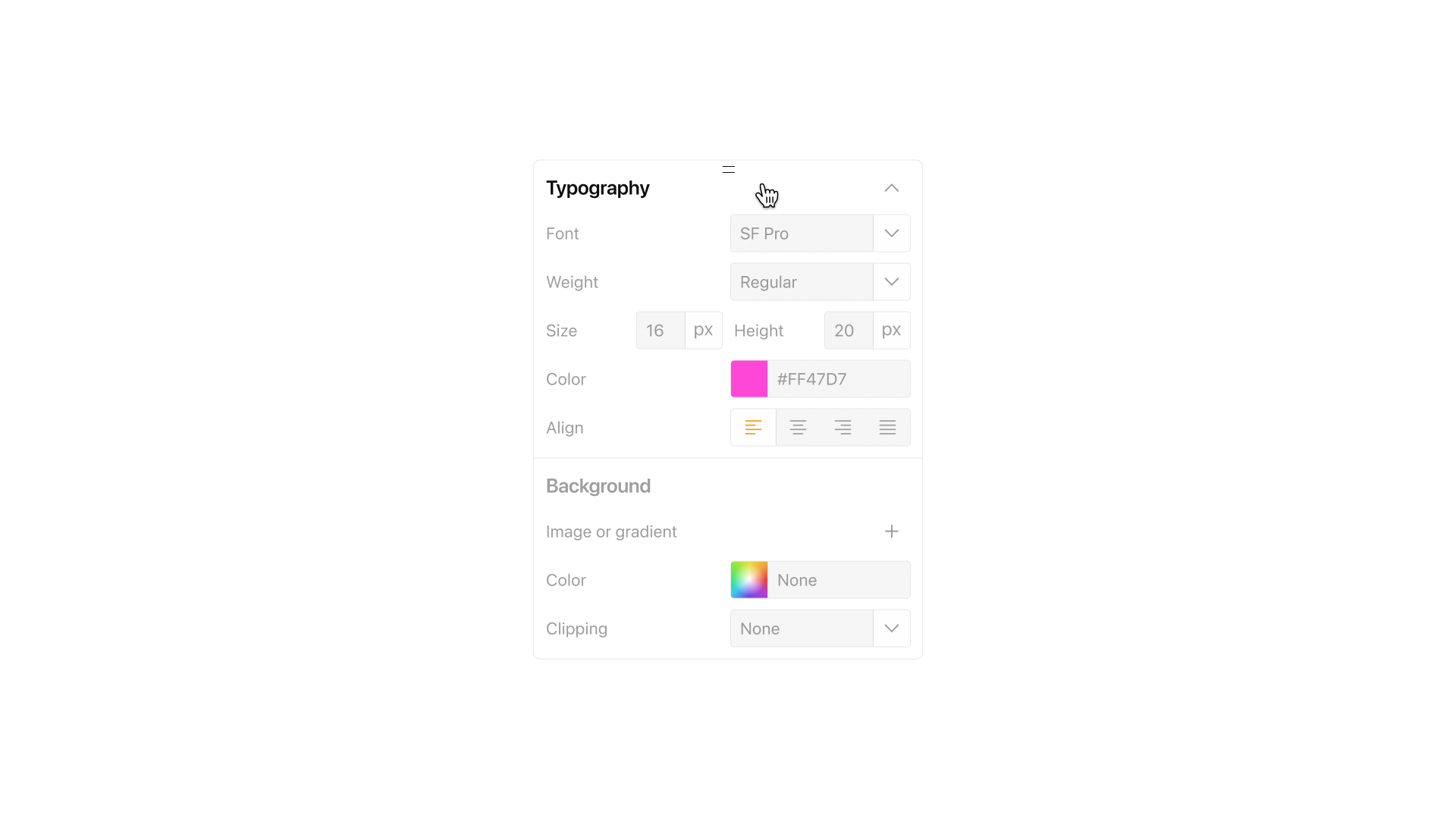
That early split kept color and type from drifting once more screens got added.
AI Designer
Type what a page needs to do, and the AI Designer assembles a layout from the components and colors already attached to the project rather than inventing new ones.
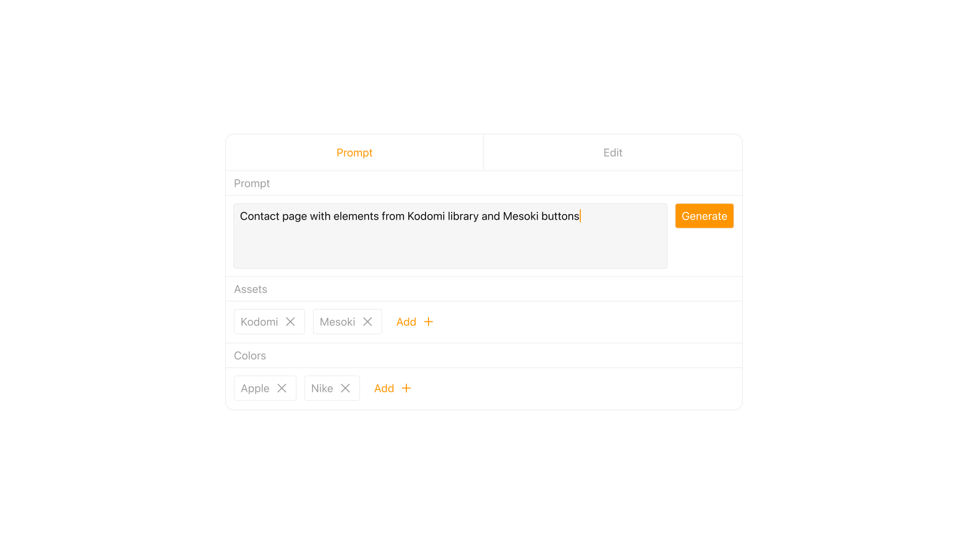
It can also open an existing screen and suggest a targeted change, a new color, tighter spacing, a different font weight, pulled from the same token set the rest of the project already uses.
Assets viewer
Every element, section, and form in a project lives in the assets editor, in one place, instead of scattered across pages.
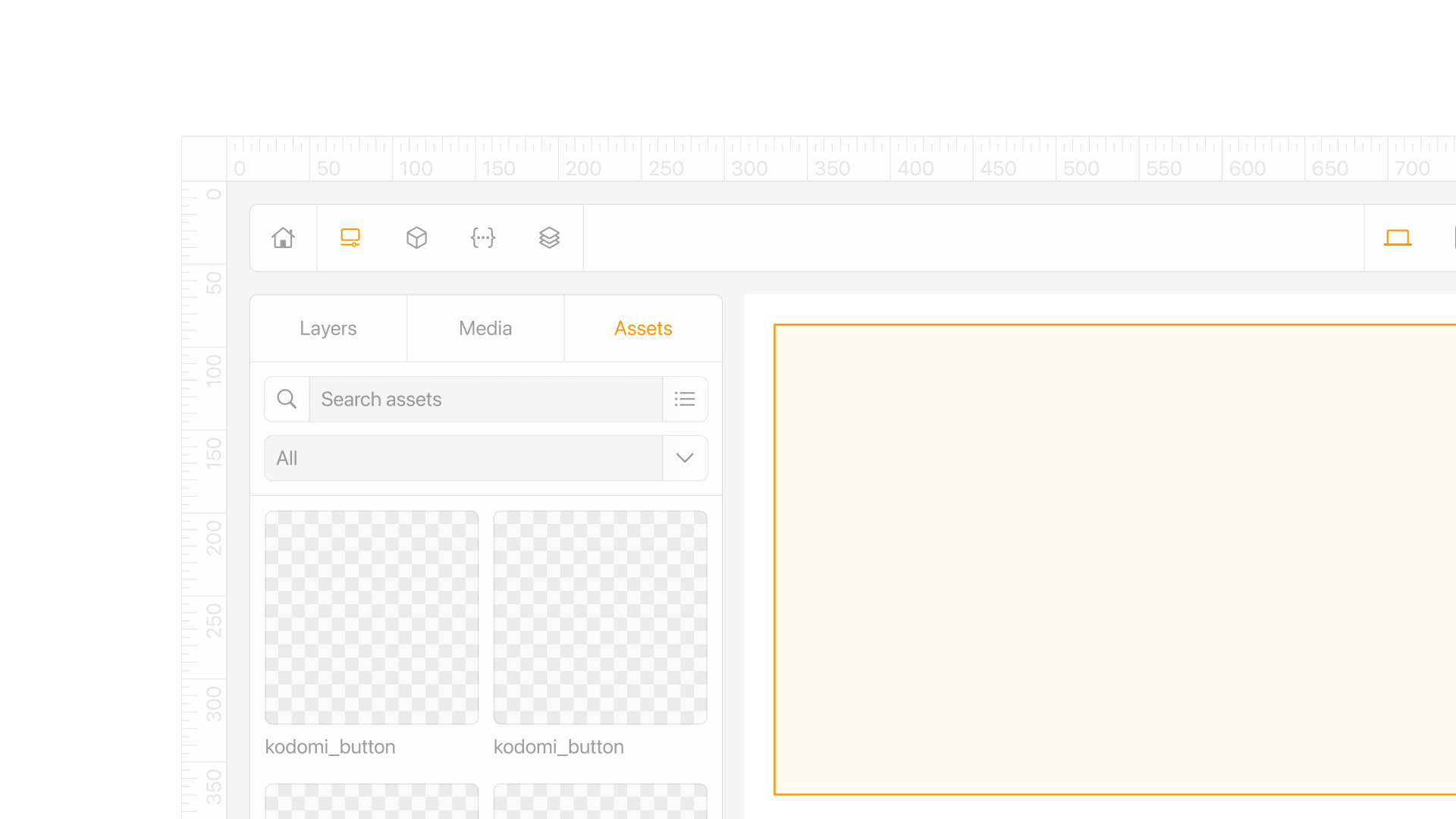
Every one of those traces back to the token it was built from, so updating one, or pulling in a newly connected library, does not require touching the pages that already use it.
Marketplace
Libraries connected through GitHub cover a designer's own components, while the marketplace covers everything else: a full kit from another team, or a single element bought on its own, a button, a color palette, a type scale.
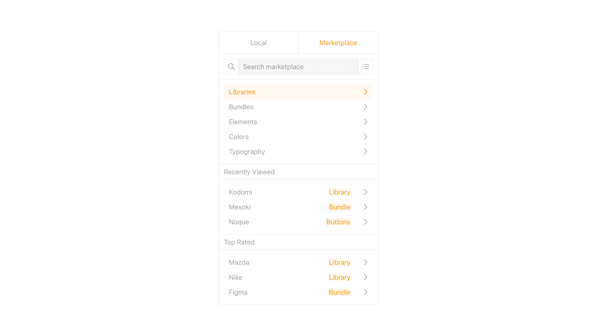
Buying one element instead of an entire library matters most late in a project, when a page is nearly finished and only needs one more piece.
Workflow
Competitive analysis fed into sketches, then wireframes, then an interactive prototype, and asset structure, tokens, and publishing stayed in a tight loop through all of it. A change to a token got checked against the sitemap before it got checked against a single screen, since one wrong value could ripple through every page that referenced it.
Role
I initiated the concept, led product design, and built the token system everything else runs on. Sitemap and flows for the first 22 screens came out of that same pass. An art director and a developer partnered on prototyping and testing, and I shaped the product strategy toward a direction we could pitch to investors.
What I learned
Modularity turned out to be a discipline, not a checkbox on a spec. Every component pulled into the token system had to give up whatever made it special, its own one-off spacing, its own shade of a color already in the palette, before it earned a place in the library, and that trade-off was the real work behind a phrase like design tokens, more than the token system itself.
Partnering with a developer early caught places where a token looked consistent inside the design tool but produced a different value once it shipped, a gap no amount of visual review alone would have caught.
Questions
A tool that lets someone assemble and publish a working site or app visually, without writing code by hand. Kodomi still runs on a real codebase underneath what a designer sees, and it is the writing of that code that gets removed from the workflow, not the code itself.