Cockpit
January 2025
Instrument cluster concept for a vehicle platform, exploring contextual information hierarchy and glance time reduction.
Case study
Instrument cluster is the panel behind the steering wheel showing speed, range, navigation, and vehicle status. They haven't fundamentally changed since the analog gauge era.
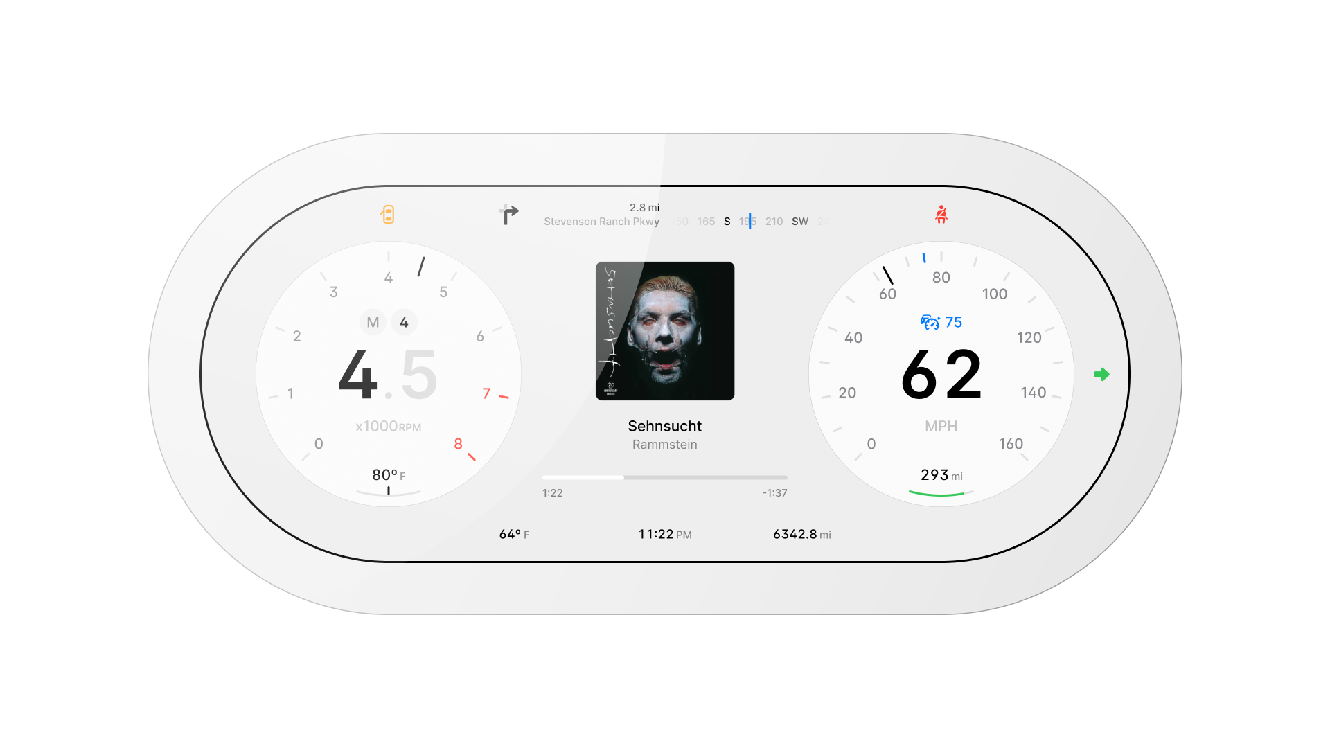
They went from physical needles to high-resolution screens, but the layout logic stayed the same. Everything visible, all the time, at equal weight.
This project questions that. One constraint defined every decision.
Every decision in this project was evaluated against that number.
ADAS status is part of the secondary data that clusters consistently fail to surface quickly. It belongs in view, but it has never been prioritized correctly.
Project overview
A concept instrument cluster for a vehicle platform. The brief was self-imposed: replace a legacy gauge cluster with something purpose-built for digital.
- No carry-over hardware;
- No analog metaphors to preserve.
HMI in safety-critical contexts operates under stricter constraints than consumer software. A wrong decision here isn't a bad user experience. It's a distraction at speed.
The problem
When digital hardware arrived, designers pasted the same patterns from analog gauges onto high-resolution screens. Two structural failures came with them.
Gauge metaphors were mechanical constraints, not design choices. A needle sweep was the only way to show continuous speed change on a physical dial.
Digital displays have no such constraint. Keeping the arc is a choice that signals familiarity at the cost of legibility and information density.
Modern clusters are museum pieces, and the problem isn't aesthetic. It's structural.
The solution
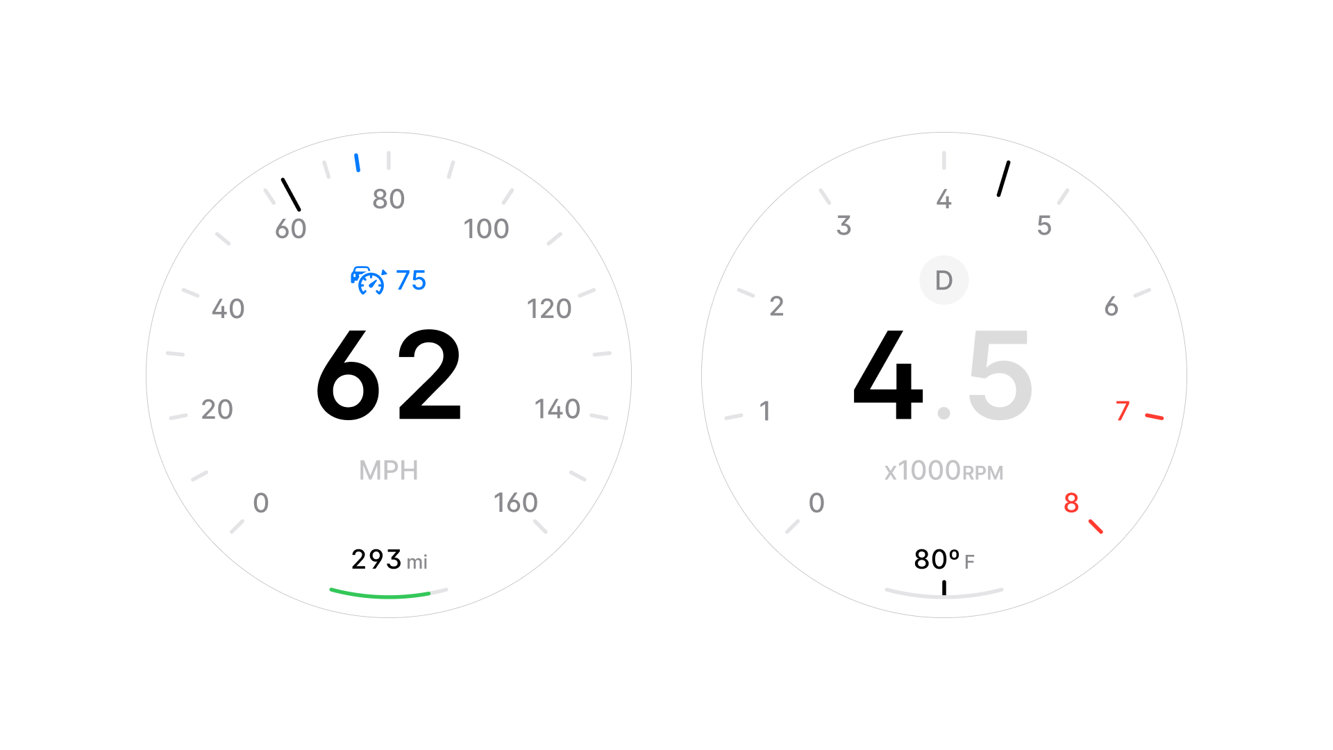
A zonal layout. Speed and tachometer always fixed, regardless of context. Everything else moves to the edges, weighted by how much the driver needs it right now.
The cluster adapts automatically to three driving contexts: Urban, Highway, and Parking. Each surfaces only what's relevant and hides what isn't.
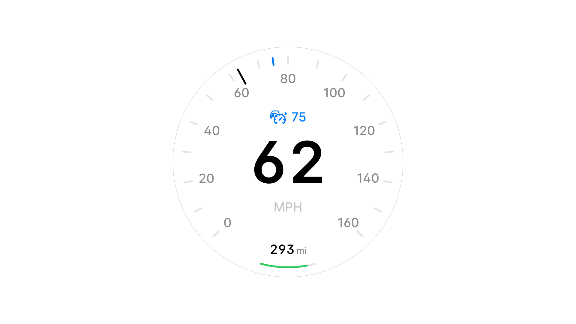
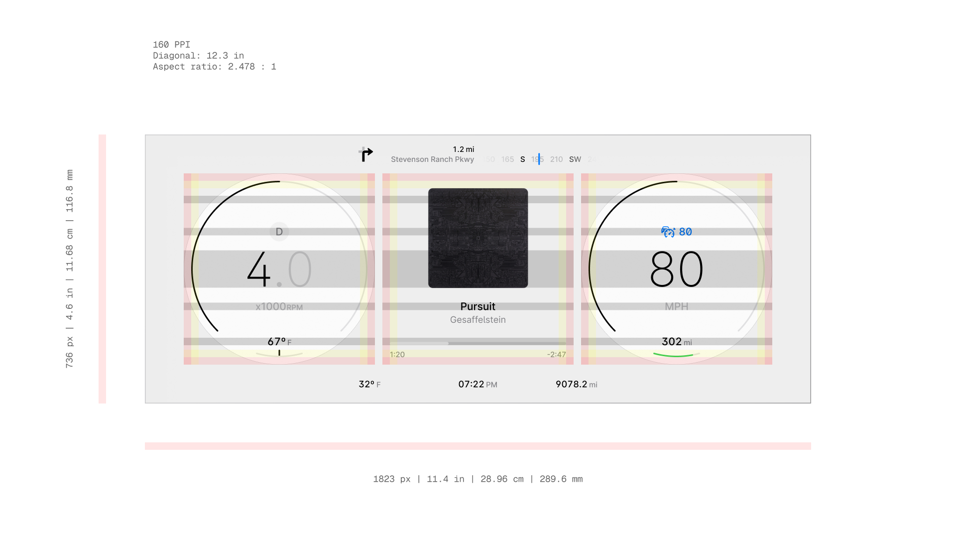
Circular speedometer dial with tick marks. Current speed displayed in large type at center. Speed limit shown above. Range with battery arc at bottom.
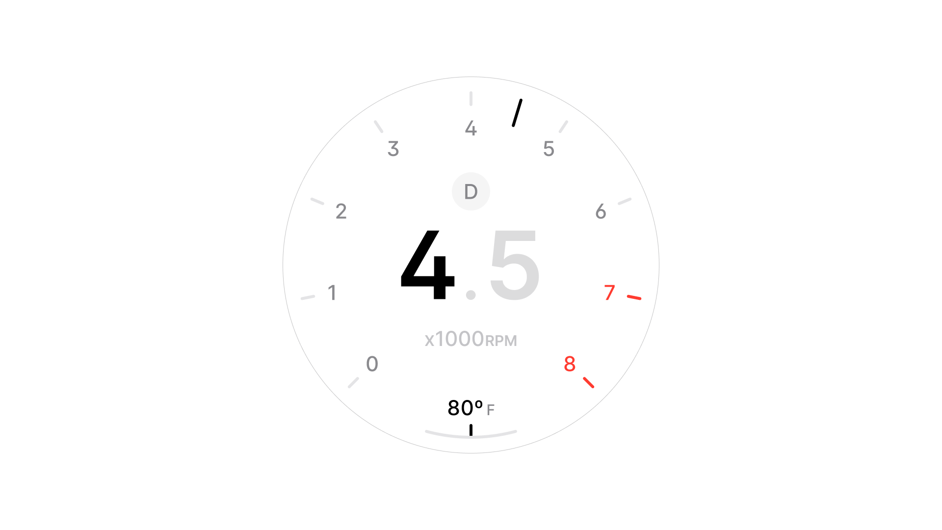
Circular tachometer dial. Engine temperature at bottom. Redline zone marked in red.
User interviews
No formal user interviews for this concept. Reference material came from observational research:
- Studying driver behavior in production vehicles;
- Analyzing eye-tracking studies published by automotive OEMs;
- Reviewing SAE and NHTSA documentation on distraction and glance time.
The eye-tracking data from OEM studies was the most useful reference. It showed not just how long drivers glance, but where attention goes first, and what gets ignored entirely at speed.
Competitor benchmarking
Audited eight existing production clusters across different vehicle segments. Mapped information zones, noted primary vs. peripheral data placement, and identified recurring failure patterns: primarily the persistence of gauge arc metaphors and the absence of context-aware hierarchy.
Every cluster audited treated all driving contexts the same. The same layout at 10 mph and 120 mph, the same information weight at a red light and on a motorway. That consistency was the problem.
Persona development
Demographic personas didn't apply here. The same driver behaves differently at 120 mph than at 15 mph: attention narrows, tolerance for complexity drops, the cost of a wrong glance goes up. So I designed around two driving states instead.
At 120 mph cognitive demand is high, attention window is narrow. The driver needs speed, navigation, and hazard alerts. Nothing else. Every additional element in view is something that has to be consciously ignored.
One design has to work for both. Not by finding a middle ground, but by adapting and showing each driver what they need at the moment they need it.
Low-fidelity sketches
Started with information architecture: what belongs in the primary zone vs. the peripheral band, and what disappears entirely at speed.
Digital wireframes
Three concept versions were developed. Each tested a different answer to the same question: what does speed look like when you remove the needle.
Kept a gauge arc for speed with a redesigned peripheral zone. Tested readable, but didn't address the metaphor problem. The arc was still there, still asking the driver to read a sweep instead of a number.
Last version became the foundation for everything that followed. The arc was gone. What replaced it wasn't a style choice. It was a legibility decision that the first two versions made unavoidable.
Gestural mapping
The cluster is display-only, with no touch interaction. Interaction design focused on state transitions:
- How the display behaves during mode switching;
- Hazard detection;
- Navigation rerouting.
All transitions designed to be readable mid-glance.
Brand style
Visual language follows neutrality: the cluster should recede during normal driving and only demand attention when necessary.
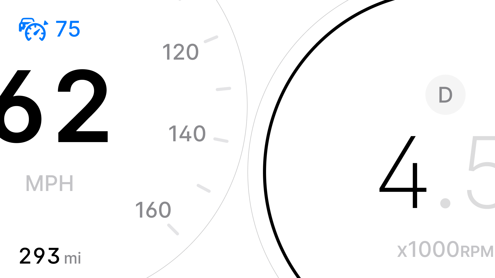
Achromatic palette with a single amber accent for warning states.
Primary type in a custom variable version of Inter, minimum 14 SP at a 2 ft viewing distance.
- Regular and above weights only;
- No fancy variants.
Accessibility
All type meets minimum contrast ratios defined in ISO 15008 for both day and night conditions.
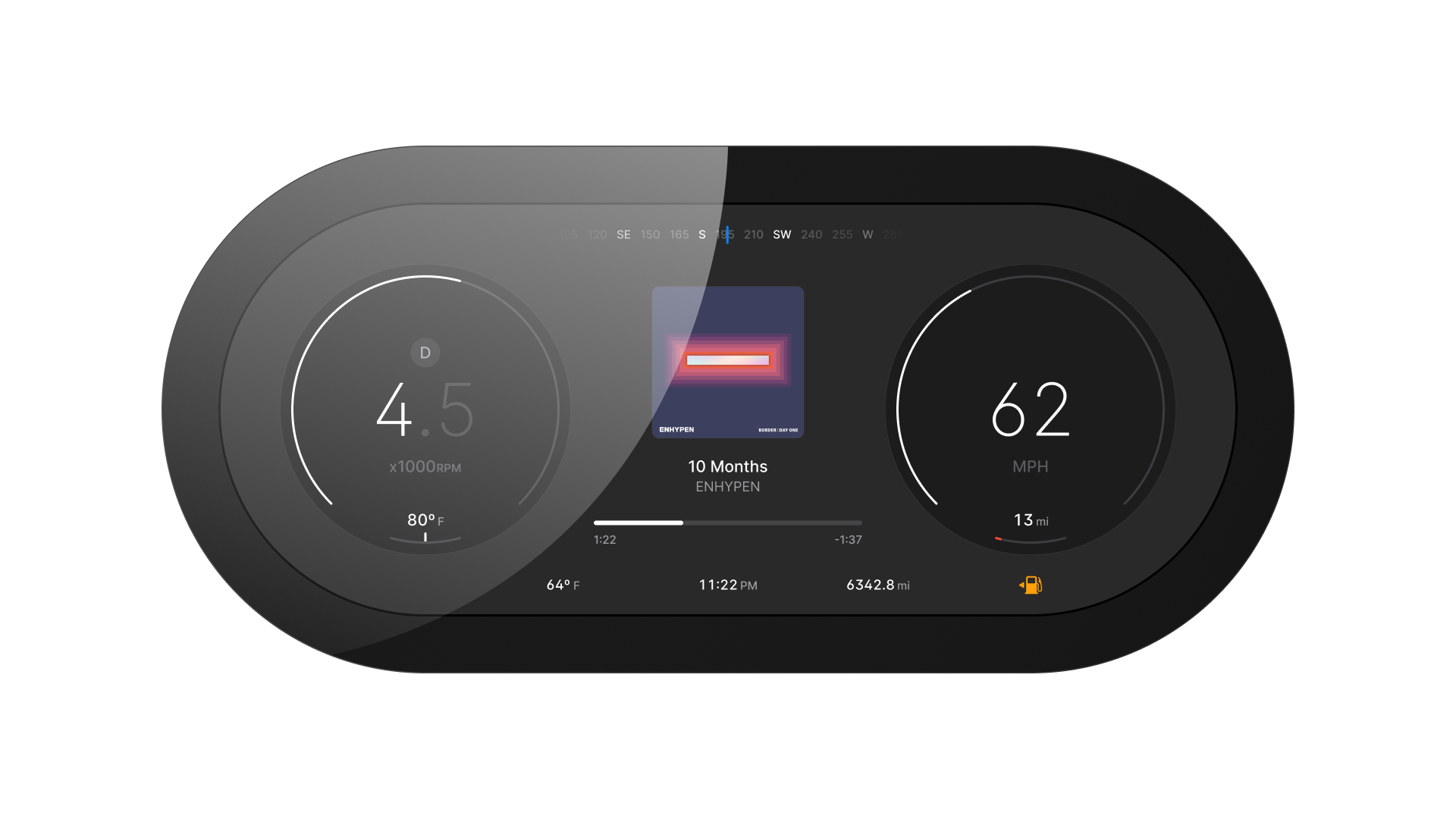
Critical information speed, navigation, direction uses size and position rather than color alone to communicate priority, ensuring readability for drivers with color vision deficiency.
Predictive navigation
Turn-by-turn navigation is always visible in the primary zone, not buried in a submenu. Distance to next maneuver updates continuously. At highway speed, only the next maneuver displays: intermediate routing is hidden until within 2 mi of a decision point.
Safety lock
Above 80 mph, no secondary content can expand or animate in the primary zone. Incoming calls, media changes, and notification states are held and surfaced only when speed drops below 40 mph or the vehicle is stationary. This is a hard constraint in the mode logic, not a soft recommendation.
Multi-modal interaction
The center panel adapts between navigation and media based on active state: if navigation is active, it takes the center.
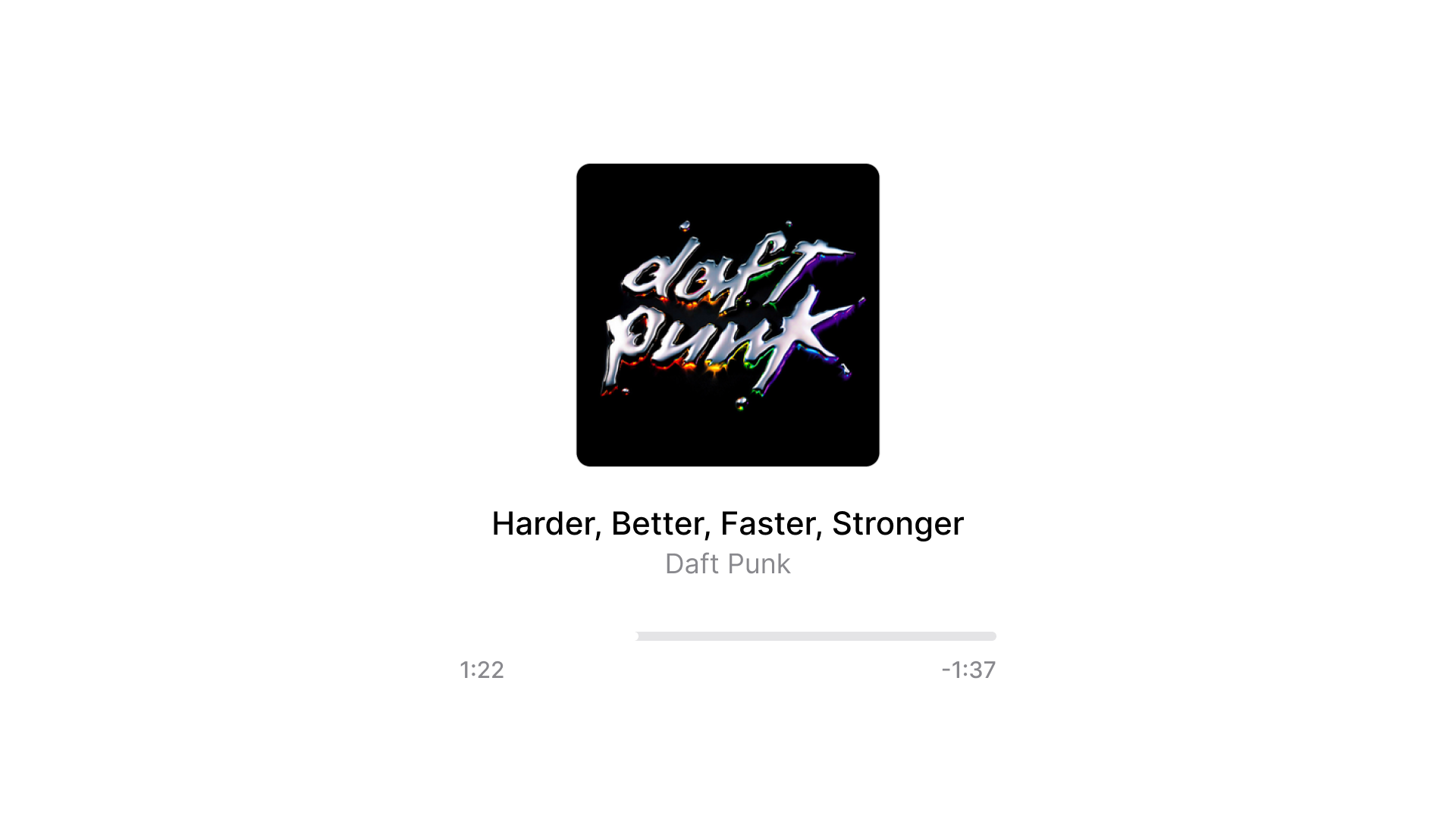
If navigation is inactive, media controls occupy that space. The driver never chooses between them; the system resolves the priority automatically.
Rendering
A 60 fps compositing pipeline targets a dedicated instrument SoC. The UI layer and navigation map tile layer are composited separately to prevent frame drops during map updates, which is a common failure mode on integrated systems.
Impact
Internal testing across three driving scenarios Urban, Highway, and Parking with a fixed-base simulator showed average glance time reduced from 4s to approximately 2s, a 2x reduction from the competitor audit baseline.
These numbers come from internal review sessions, not a formal study. The most significant contributor was the peripheral band fade above 60 mph: removing visual competition from secondary data in the primary field of view.
What I learned
Removing information is harder than adding it. Every metric that moved out of the primary zone required justification. The layout had to earn every decision.
The hardest technical constraint was designing circular elements while keeping them editable at the component level. Arcs, rings, and dials look simple on screen but break fast when you try to build them as scalable, reusable components.
Every radius change, every weight adjustment had to work across states without rebuilding from scratch. Most of the iteration time went into making the visual design actually maintainable, not the visual design itself.
FAQ
This project focuses on the instrument cluster, the primary display behind the steering wheel.
HMI in safety-critical contexts operates under stricter constraints than consumer software. A wrong decision isn't a bad user experience. It's a distraction at speed.